

How to code a book in CSS
This is the first 'theme' I designed. I call it The Long Book, as it is supposed to mimic a book, and turns out to be rather long....
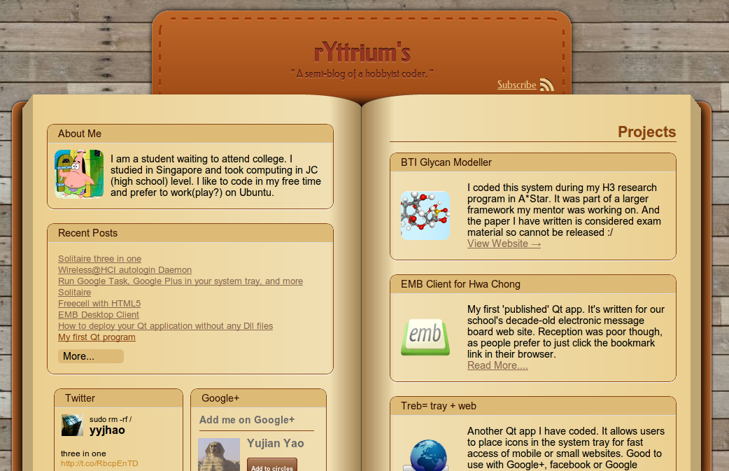
It's probably not a good blog theme-the color is too bright and distracting, the layout is too rigid and the features I used are too new to make this theme work in older browsers.
The Mark-up
The HTML mark-up is rather straight-forward:
<div id='main-body'>
	<div id='body-left'>
		<!-- the left side -->
	</div>

	<div id='body-right'>
		<!-- the right side -->
	</div>
</div>
The CSS
We first apply some CSS to make it a two-column page.
#main-body{
	width:940px;
}
#body-left, #body-right{
	width:50%;
	display:table-cell;
}
To make each column look 'bookish', we then apply a horizontal gradient and a border-radius at one side of each column.
Take the left side for example:
#body-left{
	border-bottom-right-radius: 90px 20px;
	border-top-right-radius: 90px 20px;
	background-image: -webkit-linear-gradient(
		left, #EBCF8F, #F0DFB3 90%, #a08050
	);
	background-image: -ms-linear-gradient(
		left, #EBCF8F, #F0DFB3 90%, #a08050
	);
	background-image: -moz-linear-gradient(
		left, #EBCF8F, #F0DFB3 90%, #a08050
	);
	background-image: -o-linear-gradient(
		left, #EBCF8F, #F0DFB3 90%, #a08050
	);
}
Notice that there are three color-stops in the gradient. The gradient goes from slightly dark to light near the end, then to very dark at the end. This creates a feeling of different heights along the 'page'. The same gradient and border-radius can be applied to the right side, but with the horizontal direction inverted.
Now we can add some 'decoration' around the two sides to create a feeling of 'depth' - that there are many pages underneath - as well as to add a 'book cover' below. To do so, we can use the ::before and ::after hack.
First add a display:relative to both #body-left and #body-right. Then apply the following CSS code:
#body-left::before{
	content: " ";
	display: block;
	position: absolute;
	top: 0;
	bottom: 0;
	border: 15px solid transparent;
	border-top-width: 20px;
	left: -30px;
	border-right-color: #BDA674;
}
Note that without specifying 'content', ::before will not be shown at all!
This is a 'classic' thick transparent border hack. The most basic form is the CSS triangle.
By specifying a height larger than 0 (in this case there is a distance between top and bottom), one can easily create a trapezoid. This code thus creates a darker trapezoid at the left of the left side to mimic a number of pages underneath. The larger border-top-width is a tweak to make it look more realistic.
Again, the same code can be applied to the right side, with the horizontal direction inverted.
The 'book cover' is easier - just a rounded rectangle behind each sides.
#body-left::after{
	content: " ";
	position: absolute;
	top: 10px;
	bottom: 5px;
	background: #BD672A;
	z-index: -1;
	border-radius: 15px;
	box-shadow: 0 0 5px black, inset 0 0 3px white;
	left: -30px;
	right: 40px;
}
Lastly, a little bit of shadow below both sides to make the feeling of depth more realistic.
#main-body{
	display:relative;
}
#main-body::before{
	content: " ";
	position: absolute;
	left: -15px;
	right: -15px;
	top: 15px;
	bottom: 15px;
	box-shadow: 0 0 20px 5px black;
	background: black;
	border-radius: 15px;
}
We don't use #body-left and #body-right due to the rounded corner at the side. And we use #main-body::before instead of #main-body because this allows use to shrink to size of the shadow in the vertical direction and enlarge in the horizontal direction to accommodate the 'irregular' shape of the two sides.
That's it! A simple mark-up with some fanciful CSS3 hacks. No use of images at all.
Drawbacks
This way of styling clearly ignores the principal of Progressive Enhancement since the page look really really terrible in browsers that don't support gradient and border-radius (such as IE8 and below). It looks OK on IE9, but since IE9 doesn't support linear-gradient, the appearance is still a bit weird.
Aside from that, there seems to be a bug in both IE9 and IE10 that the absolute alignment of ::before of both sides only match the height of the contents rather than the block, thus leaving behind a piece of black shadow. Very annoying indeed!